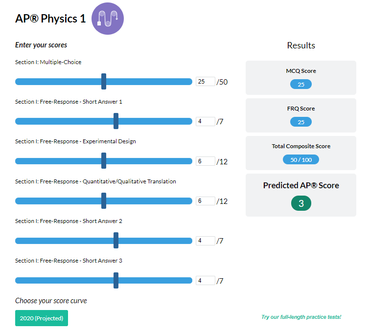
Introduction
In this article, you will learn about some of the useful concepts in statistics like quartiles and the Interquartile Range (IQR). These concepts allow graphical representation of several probability distributions and also help create box and whisker plots, which are an effective way to represent and compare data.
Quartiles
Quartiles are a fairly simple concept in statistics. In a ranked data set, quartiles are the three values that divide the data set into four equal parts. Each of the four parts contains 25% of the data.
- Quartile 1 is the smallest quartile. 25% of the data set is below quartile 1 and 75% of the data set is above quartile 1.
- Quartile 2 is also called the median. It is the midpoint of the data set. 50% of the data set is below the median and 50% of the data set is above the median.
- Quartile 3 is the largest quartile. 75% of the data set is below quartile 3 and 25% of the data set is above quartile 3.
When the number of data points in the data set is odd, then quartile 2 or the median is the middle value, so that there is an equal number of data points on each side of the median. If the number of data points is even, then the median is the average of the two values in the middle.
Example 1:
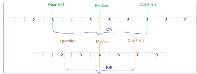
Consider the following data set: 5, 6, 8, 6, 7, 9, 1, 2, 4, 3. Find the quartiles.
- First, arrange the data set in ascending order. 1, 2, 3, 4, 5, 6, 6, 7, 8, 9
- The number of data points = 10. Find quartile 2 first, i.e. the median. The median is the middle of the data set – a number that will ensure that 50% of the observations are on the left and 50% on the right. Quartile 2, or the median, is the average of the two middle numbers 5 and 6 = 5.5. The number 5.5 basically divides the data set into two equal parts.
- Quartile 1 = 3. Median divides the data set into two equal parts – the left part and the right part. Take the left part and find its median or the middle The median of the left part will be quartile 1. This ensures that 25% of the observations are on the left of it and 75% of the observations are on the right.
- Quartile 3 = 7. Median divides the data set into two equal parts – the left part and the right part. Take the right part and find its median or the middle The median of the right part will be quartile 3. This ensures that 75% of the observations are on the left of it and 25% of the observations are on the right.
Example 2:
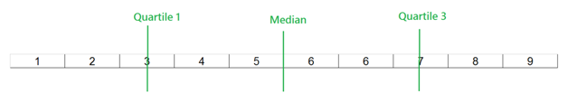
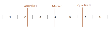
Consider the following data set: 4, 6, 1, 7, 9, 2, 3. Find the quartiles.
- First, arrange the data set in ascending order. 1, 2, 3, 4, 6, 7, 9
- The number of data points = 7 (which is odd). Find the median, the middle value, first. Median = 4. This is found by dividing the data set into two equal parts. If you notice, there are 3 data points to the left of 4 and 3 data points to the right of 4.
Look at the diagram below. Quartile 1 = 2 and Quartile 3 = 7. Median divides the data set into two equal parts – the left part and the right part. The middle point of the left part is quartile 1 and the middle point of the right part is quartile 3.
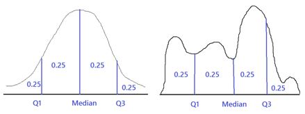
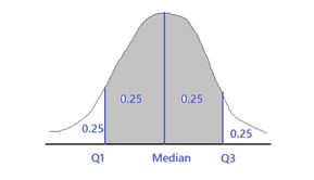
You have learned how to find quartiles for discrete data. For continuous data, the idea behind quartiles remains the same. Consider continuous probability distributions. The total area under any probability distribution curve is 1.
- Quartile 1 is the point so that the area on the left of it is 0.25 and the area on the right of it is 0.75.
- The median is the point so that the area on the left of it is 0.5 and the area on the right of it is 0.5.
- Quartile 3 is the point so that the area on the left of it is 0.75 and the area on the right of it is 0.25.
Example 3
Below are two graphics that show quartiles for continuous probability distributions.
Example 4
Consider a continuous uniform distribution that takes value 0 for values of X from -0.25 to 0.75 and takes value 0 otherwise, as shown below. Find the quartiles.
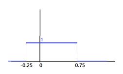
The area of the rectangle in the diagram above is height*width
Height = 1
Width = 0.75 – (-0.25) = 1
Therefore, area = 1
Dividing this rectangle into four equal parts would mean that area of each part is ¼ = 0.25
Area to the left of x=0: 1*(0-(0.25)) = 0.25
Area to the left of x= 0.25: 1*(0.25-(-0.25)) = 0.5
Area to the left of x= 0.5: 1*(0.5-(-0.25)) = 0.75
Quartile 1: x=0 (25% of the area of the rectangle is on the left of x=0)
Median: x=0.25 (50% of the area of the rectangle is on the left of x=0.25)
Quartile 3: x=0.5 (75% of the area of the rectangle is on the left of x=0.5)
Interquartile Range (IQR): How to Calculate it?
The interquartile range represents the middle 50% of the data. It is related to quartiles because it is the difference between the third quartile and the first quartile. It is given by:
IQR = Quartile 3 – Quartile 1
Once you know how to calculate quartiles, calculating IQR is quite easy. Just subtract the first quartile from the third quartile.
Example 5
Find the interquartile range for the data in Examples 1, 2 and 4
In Example 1, the interquartile range is Q3 – Q1 = 7 – 3 = 4
In Example 2, the interquartile range is Q3 – Q1 = 7 – 2 = 5
In Example 4, the interquartile range is Q3 – Q1 = 0.5 – 0 = 0.5
Some illustrations of an interquartile range are shown below. The interquartile range covers 50% of the data in the middle. The lower and the upper points of this middle 50% area are quartile 1 and quartile 3, respectively. So, the IQR is the difference of the two.
The below diagrams show the interquartile range for discrete data taken in examples 1 and 2.
To summarize, follow these steps to calculate interquartile range:
- Arrange the data in ascending order.
- Make three cuts to divide the data into four equal parts.
- The three cuts are quartile 1 (the lowest quartile), median (the middle quartile) and quartile 3 (the largest quartile).
- Find IQR using the formula IQR = Quartile 3 – Quartile 1.
Now that you understand quartiles and interquartile range, there are other ways to interpret these concepts.
The median of the data is the middle value, which divides the data into two equal parts – let’s call them the first part and the second part. Quartile 1 can be interpreted as the median of the first part and Quartile 3 can be interpreted as the median of the second part.
Quartiles will help you measure how the data is distributed on the two sides of the median. For example, if the first quartile and third quartile are almost equally far away from the median, then the data is roughly symmetrical. If quartile 3 is far away from the median but quartile 1 is closer to the median, then data points larger than the median are spread far apart whereas data points smaller than the median are closely packed.
While the above examples gave you a taste of the use of quartiles, box and whisker plots will show how you can use quartiles and interquartile range to represent, interpret and compare data effectively in a visual manner.
Box and Whisker Plot
One of the major uses of quartiles and interquartile range is that they are used to draw box and whisker plots. Box and whisker plots are an effective way to represent data and visualize the distribution of the data, outliers, the symmetry of the data, etc.
Constructing a box and whisker plot
Step 1: Order your data in increasing order.
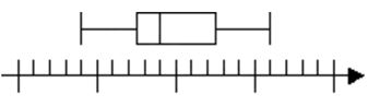
![]()
Step 2: Find quartile 1, quartile 3 and the median using the methods described above. Also find the maximum and minimum values.
From left to right, the lines represent, minimum, quartile 1, median, quartile 3 and maximum of a data set. These points are collectively known as a five-point summary for making box and whisker plots.
Step 3: Complete the box and whisker plot by drawing a box around the middle three lines (quartile 1, 2, and 3) and drawing whiskers from the central box to the minimum and maximum values.
Notice that the end points of the box are quartile 1 and quartile 3. The box contains 50% of the data points. Thus, the difference between the end points of the box gives the interquartile range.
Outliers
Another major industry use of quartiles and interquartile range is to find outliers in data. Outliers are values that are on the extremes and are likely to not represent the population correctly. Outliers may be caused by data collection errors or other issues. For example, imagine you collect data for weights of students in a school. You found that all student weights are between 40 kilograms and 120 kilograms. But there is one student whose weight is reported as 610 kilograms. This is an outlier. It is not possible for a student to weigh 610 kilograms. This outlier may have happened because of reporting an error or other reasons. Hence, whenever studying data, you should always consider removing outliers. The next question is: how do we find outliers?
Quartiles and interquartile range give an easy way to find outliers. After you have found quartile 1, quartile 3, and the interquartile range, find the lower and the upper fence as follows:
Lower fence = Quartile 1 – 1.5 * IQR
Upper fence = Quartile 3 + 1.5 * IQR
Any data point that lies below the lower fence or above the upper fence can be treated as an outlier. These are the lower and the upper limits on the data. They can be used as bounds for outlier identification.
Another use of IQR is to find another statistic called semi-interquartile range or quartile deviation, which is defined as half of the interquartile range.
Example 6
Consider the following data: 10, 16, 11, 7, 4, 4, 4, 12, 17, 25, 14, 0
Find quartile 1, quartile 3, median, interquartile range, minimum value, maximum value, outliers (if any), and quartile deviation. Create a five-point summary of the data and also draw a box and whisker plot.
Step 1: Arrange the data in ascending order.
0, 4, 4, 4, 7, 10, 11, 12, 14, 16, 17, 25
Step 2: Find median.
Number of data points = 12, which is even.
Median = Average of 6th and 7th value = (10+11)/2 = 10.5
Step 3: Find quartile 1 and quartile 3 by making cuts. The median found in Step 2 divides the data points into two equal parts – the left part and the right part. Make cuts in the middle of both parts so that the left and the right part are further divided into two equal parts each, giving you four equal parts.
Quartile 1 = (4+4)/2 = 4 (Make a cut between the 3rd and 4th data point and take the average of those two points)
Quartile 3 = (14+16)/2 = 15 (Make a cut between the 9th and 10th data point and take the average of those two points)
Step 4: Find interquartile range, quartile deviation, minimum and maximum value.
IQR = Quartile 3 – Quartile 1 = 15 – 4 = 11
Quartile deviation = IQR/2 = 5.5
Minimum value = 0
Maximum value = 25
Step 5: Find lower and upper fence.
Lower fence = Quartile 1 – 1.5 * IQR = 4 – 1.5*11 = -1.5
Upper fence = Quartile 3 + 1.5 * IQR = 15 + 1.5*11 = 20.5
25 is an outlier in the data as it is greater than the upper fence. There are no data points that are smaller than the lower fence.
Step 6: Create a five-point summary of data and draw box and whisker plot.
The five-point summary of the data is 0, 4, 10.5, 15, 25.
These are the minimum value, quartile 1, median, quartile 3 and maximum value in ascending order.
The box and whisker plot is shown below.

Notice that quartiles will help you to measure how the data is distributed on the two sides of the median. Here the first quartile and third quartile are not equally far away from the median, so it is clear that the data is not symmetrical. Here, quartile 1 is far away from the median but quartile 3 is closer to the median. This means that the data points that are smaller than the median are spread far apart whereas data points greater than the median are more closely packed.
Conclusion
In conclusion, quartiles and interquartile range are quite important concepts in statistics. They can effectively help in representing and interpreting data in a visual form. They can also be used to calculate other statistics like quartile deviation. They give us an idea of what the distribution of a data set looks like. Sometimes, looking at these values tell us whether the data is symmetrical or skewed. Thus, they are simple yet useful concepts and you must always remember them.
Let’s put everything into practice. Try this Statistics practice question:
Looking for more Statistics practice?
You can find thousands of practice questions on Albert.io. Albert.io lets you customize your learning experience to target practice where you need the most help. We’ll give you challenging practice questions to help you achieve mastery in Statistics.
Start practicing here.
Are you a teacher or administrator interested in boosting Statistics student outcomes?
Learn more about our school licenses here.