What to Expect in ACT® Science Graphs
The ACT® Science section is easily perceived as one of the most intimidating parts of the ACT® exam. With 7 passages and numerous charts, graphs, and tables to interpret, and less than 6 minutes per passage to complete, this task can seem daunting, especially at the end of an already long exam. Nevertheless, like all monsters, if you go in with the right information, it is easy to attack and conquer. The ACT® is formulaic; the more exposure you have will help you recognize the types of patterns the ACT® uses. This article presents a thorough list and explanation of every type of visual that might show up on the exam and how to dismantle it. You need a game plan, an optimized ACT® study guide, which on your own may seem time consuming and costly. However, don’t worry, we made one for you.
What are the ACT® Questions Asking You?
First, you must identify what exactly the ACT® is asking you. For the most part, there will be only a few types of questions. They are listed here in order of frequency.
- Data grabs
- Graph interpretation
- Text interpretation
- Outside knowledge
The vast majority of the questions are data grabs. The ACT® science section does not care about your actual knowledge of biology, chemistry, or physics, but it does care about how well can you find specific details in confusing passages with graphics under pressure. That skill is being tested. That is why knowing how to break down the graphs is imperative. The text and passages attached are typically distractors and are there to intimidate you — you can’t be intimidated if you don’t pay attention to them. As stated before, text interpretation questions don’t happen as frequently. Only go to the passages when necessary.
Where to Focus: Know the Parts of a Graph
Once you have begun the Science section, your strategy will be to go directly to the graphs, charts, or tables. Only refer to the text when you need extra information on a question (typically a definition which will be italicized, helping your eyes find the information faster). Make sure to understand, take notes, and highlight the following key aspects of the graph.
Axis
The axis are the vertical and horizontal lines at the bottom and left side of the graph, also known as the x- and y-axis. They indicate what relationship is being represented between variables and what variable is being controlled
Labels
The labels will be names, words, numbers, symbols, or letters that represent the axes and the independent and dependent variables. They will define to you what types of variables are being measured.
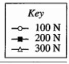
Key
This will be an icon, or set of icons, that differentiates what the different symbols mean on the graph. This will only appear when there are 2+ variables being measured. Don’t worry about what any of it means on a deeper level. You don’t need to understand what ph or base means. Just recognize the relationship (Is one increasing as the other decreases? Are they both increasing or decreasing at a steady rate?) and focus on what the questions ask you. Always make sure you are properly differentiating between the different variables represented by the key.
It will look something like this guy.
Units of Measure
Don’t pay attention to them. It may be a knee jerk response to figure out what they mean, but as long as you recognize the relationship between the variables, the unit of measure doesn’t matter. Just recognize if the values are increasing or decreasing and at what rate. The answer choices will always match the units used in the graph and text, and it is there to distract and confuse you. The ACT® will not ask you to convert any measurements.
Text
If you find that the graphs don’t provide you with all the information you need, search in the text. When you read the passage, at first you may believe every word is of equal importance, but it’s not. The ACT® only cares about 6 pieces of information and if you can find them. Focus on what the ACT® is asking you and work backwards.
Approach
Know how to Spend Your First 30 Seconds.
- How many graphs/charts/tables are there?
If there is more than one, compare and contrast to find the relationship between the two. - Note the direction of the axes and whether they are running in the normal direction. Adjust if they aren’t.
- Note whether there are keys and/or multiple curves on graphs and what each one signifies.
- Identify how many experiments there are and correspond each question to each experiment.
Take Great Notes.
When you first see a graph on a passage, you must break it down, find the relationship, and then write out the relationship in your own shorthand in the margins. I draw arrows, pluses, minuses, or any indication to help me quickly remember the relationship without constantly re-reading the table or graph. I also circle the smallest and largest numbers so I am not wasting time re-scanning the chart/table/graph. Interpreting the table before addressing the questions is going to be vastly important. Write what the relationship is (positive, negative, neutral, or none) and move onto the questions. Taking notes not only allows you to highlight all the key information needed but also helps you maintain focus. The physical activity of pen on paper will keep you attentive as you use a second sense to interpret and understand the content. Humans learn best when we are taking in information through multiple senses. Don’t deny yourself accurate interpretation.
Now that we are acquainted with the graph, let’s look at the questions.
Connect the Questions to the Graph
When you dive right into reading the text, you believe that all of the information is of equal importance and don’t know what to focus on. However, the ACT® exam only cares about 6 pieces of information. Start with reading the questions first and let them guide you — only go to the text when necessary. If there are any unclear variables, labels, or measurements, refer to the text because it will be explained there. However, for the most part, the questions will be data grabs — asking about a specific point on the graphic and interpreting it. Not only will there be more data-grabs, but they will be faster to answer since you are only analyzing the graph instead of reinterpreting the text (which uses intentionally confusing language).
If you notice that there are three figures, but the questions only ask about two of them, ignore the third. Don’t waste precious seconds on what seems enticing or confusing, just focus on what it is asking you.
Types of Graphs and Charts
Below are all of the images that might appear on the ACT® Science section. On each science section, there might be a combination of these different charts/graphs/tables, so be prepared with strategies to tackle all of them. Five types of images will appear on the ACT® Science section, but you don’t have to pay attention to all of them.
We will move from easiest to hardest.
Tables
ACT® Science sections will have tables that include many rows and columns of data, but the technique is always the same.
Here is how to breakdown a question when asking about a table
- Identify if there are several tables and note the differences.
- Identify the table in question.
- Circle the correct column in question.
- Search and circle the data point in question.
- If you are looking for several points, find the matching data point by looking to the left or right of the same row.
Don’t always assume that the numbers are in chronological order. Make sure to take note when you need to re-write them.
Additionally, there might not be a relationship. If there isn’t, that is OK. Just focus on what the question is asking you.
Let’s look at this table, identify any relationships, and answer the question.
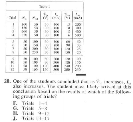
We don’t need to read any text for this question. First, we find the variable in question (Em), the variable (In), and where they increase. We can immediately eliminate choice J because there are no Trials 13-17. Then we can eliminate answer choices F and G because during both of those trial periods (1-4 and 5-8), the relationship between the two variables stays the same. That leaves us with answer choice H and is confirmed in the table.
Bar Graphs
Bar graphs are the simplest form of ACT® Science graph because of the direct way information is presented. A bar graph will have rectangular bars with lengths that are in relation to the variables that they symbolize. Bars on a bar chart can be plotted vertically or horizontally. Bar graphs are good for plotting data that spans a length of time (like comparing one trend over several years) or for comparing several items in a related category (measuring different types of birds eating habits over multiple years).
Let’s take this next one.
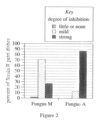
We can immediately note that there are two variables being tested (Fungus M and Fungus A in relation to the percent of Strain R in petri dishes). The key indicates that there were three degrees of inhibition: little, mild, or strong within each Fungus type. We can note that in Fungus M the mild bar is the tallest at 70%, the strong bar had some effect at 25%, and the little/none bar had little effect at 5%. In Fungus A, the strong bar is the tallest at 85%, the mild bar had some effect at 15%, and there is no little/none bar.
15. Consider the petri dishes containing Strain R and Fungus M. What percent of those dishes exhibited a mild degree of inhibition?
A. 2%
B. 13%
C. 23%
D. 71%
Since we have already established a relationship, identified the bars, and know what the bars represent, this is a fast question. We go to the Fungus M bar, identify the mild degree, and choose choice C.
Illustrations and Figures
Illustrative graphs represent actual physical objects and give scientific information about them. Some illustrative diagrams can be quite elaborate, such as this graphic of a — most of the time these are distracting. Make sure the question is directly asking about the image.
Like this guy.
Or this guy.
They both are distracting illustrations, but most likely they will never be asked about. Focus on the images that describe relationships and what the questions ask you to focus on.
Scatter Plots
Scatter plots is a graph that has several points “scattered” on the graph. They are typically showing unstable relationships between two variables or several sets of data. These can look intimidating and chaotic, but make sure you are identifying the correct point or points. Scatter plots will have a key, identifying the different variables plotted on the graph.
In this scatter plot below, the key indicates different symbols representing different water temperatures: 50˚C is o, 40˚ C is ∆, and 30˚C is a square. Each one of these variables is plotted according to its trend and relationship to time (seconds). To help you visualize sometimes confusing trends, draw a line through the scatter plot to see how the points connect.
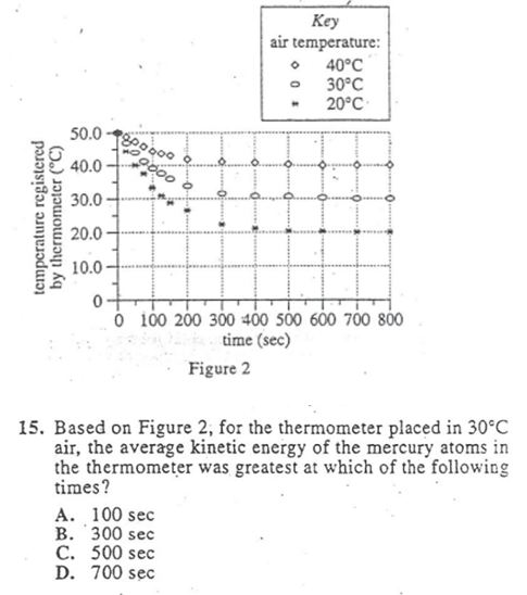
Again, this question is just a data grab. We look at the key for 30˚C (the middle one) and see at what point it is greatest between the answer choices. Make sure you are identifying the correct line, as these can be tricky! After identifying the correct line, we can note that answer choices B, C, and D are all pretty much the same and lower than answer choice A.
Line Graph
Line graphs are the neater version of scatter plots. They also measure a relationship between different variables or data. The line graph exhibits a clear direction, connecting all of the points on a scatterplot. There might be several lines representing several relationships, and the keys on the line graph might be trickier to read. With line graphs it will be important to isolate a point, make sure you circle it, and pay attention to the details. This graph might not provide a clear point, and you have to fill it in on your own.
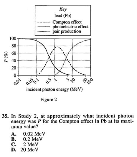
Okay, this one can look daunting. There are a bunch of lines happening at different stages, but you got this. Focus on what the question is asking you. We need to recognize the different labels for each line (write them in!). Then focus on which line the question is asking you about. We are looking for the MAXIMUM value of Compton effect (Then what? Doesn’t matter.) in relation to MeV (whatever that is). OK, we identify that the dotted line with larger lines in the center of the graph is an upside down parabola (kind of). Now, find the area where it is at its highest point (somewhere around 2/3ish MeV) and find the closest answer choice to our anticipated guess. Eliminate any answer choices that clearly don’t make sense. Our answer is C.
Region Graphs
Region graphs are the least common on the ACT® test; however, it is good to know they might show up. A region graph demonstrates multiple different scientific properties that take up different areas on a chart. This ACT® chart will come with a key, and it will be important for you to make sure you are interpreting it correctly. Take this key for instance — the variables on the chart indicate that water flow depth (our y-axis) is being compared to water velocity (m/sec) (our x-axis). The key indicates the different regions that are being measured: ripples, dunes, and erosion of sediment, no bedforms.
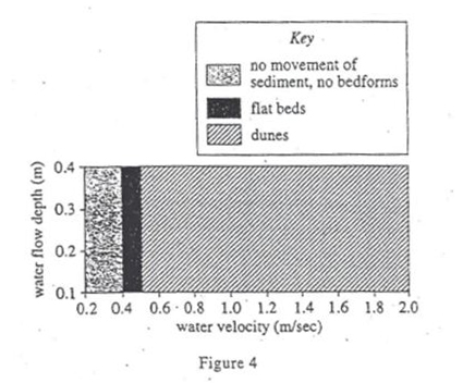
What is that? Breathe! Let’s break down step-by-step what the question is asking. The question is asking us to identify at any given point for water velocity (meaning anywhere on the x-axis) as the water flow increases (going up the y axis) the type of bedform do? So, first, go to the chart, pick any two or three random points on the x-axis, and see how it changes in relation to the y-axis. Let’s pick .2 on the y-axis and see it in relation to .6 on the x-axis. As we continue to go up the y-axis, the region doesn’t change. Let’s do that for another one. Pick point .2 on the x-axis and .2 on the y-axis. Again, as we increase the y-axis, the region doesn’t change, meaning there is no change between the water velocity and water flow depth. The answer is J.
Strategies for the ACT® Science Graphs
Labels are everything, so make sure you interpret them correctly. Remember to check and interpret the relationship between the x and y-axis and the key if one is provided.
Take good notes re-interpreting the graph and highlighting trends. This will be easier on your eyes, energy, and time than constantly going back and forth between the question and the graph.
Double-check the text for additional information about the graph, but only when you need more information than what the graph is giving you to answer a question.
If you are asked about an unknown data point outside or within the range of given values, look to continue a consistent pattern to predict the value. Remember to draw it in!
Eliminate all answer choices that are clearly wrong and don’t pertain to the question. The act of physically eliminating an answer choice gives you more brain space and confidence to lead you to the correct answer. Those answer choices are there to see if you are paying attention.
Difference between “control” and “controlled”
- “Control” means that it is the dependent variable or the variable that is not changing. It stays the same and will typically be equated to 0.
- “Controlled” means that these variables are independent and manipulated in relation to the control. The control is not changing; the controlled is changing.
When a question gets overwhelming, split it up into chunks and tackle one chunk at a time.
Never feel like you have to answer everything right away. You are free to skip around the whole section until the time is up. If you find yourself focusing too hard or getting too confused on a problem, skip it and move on. It is better for you to plug ahead and focus on the questions you know you can answer, than waste precious seconds you can’t get back.
Categorize each type of question when you are doing your ACT® practice. That will make it easier for you to find patterns of where you need to strengthen.
Take note of the areas you need to focus more intently on. Remember that what is being tested is how well can you find specific details in an intimidating passage under pressure. So, are you being tripped up on reading the graphs? Maybe misreading the passage? Take your time while practicing and get used to the science section and the types of questions and visuals they will provide. The more exposure you have, the more prepared and comfortable you will feel.
Recap
Here’s a breakdown of the steps you should take:
- Properly identify the labels and take good notes about them. Make sure you’re identifying the correct visual in question.
- Identify the basics of the graphs — what the axes represent, how are the data points are depicted (is this a line graph or a scatter plot?), then how to get to the point in question.
- Ignore the units of measure.
- If you struggle with the ACT® Science section, do ACT® practice first to get familiar with it. Then utilize the strategies and practice, practice, practice.
Conclusion
Now you have been exposed to all the strategies and ACT® Science graphs to optimize your ACT® study guide, organize your practice, and tackle the ACT®! As long as you take the time to remember what to identify, circle, and interpret, you will ace the exam.
For your next article, read… The Ultimate Guide to Get a 36 on the ACT® Science Section
Which graph do you need the most help with? Let us know!
Looking for ACT® practice?
You can find thousands of practice questions on Albert.io. Albert.io lets you customize your learning experience to target practice where you need the most help. We’ll give you challenging practice questions to help you achieve mastery of the ACT®.
Start practicing here.
Are you a teacher or administrator interested in boosting ACT® student outcomes?
Learn more about our school licenses here.